A class project to rebrand an iconic Scottish Whiskey distiller.
This speculative evolution of White Horse Whiskey is designed to appeal to adults of all ages by expanding the target market to encompass a younger more diverse audience while honoring the brand’s Scottish heritage. A goal is to position White Horse in competition with other leading blended Scotch whiskey brands like Johnnie Walker, Ballentine’s, and William Lawson’s.
My conceptual approach explores a whole new meaning for the image of the white horse. Scotland is a country rich with culture and folklore. My solution leans heavily into local mythology and symbolism.
Branding + Packaging + EGD / Core Topics / Fall 2022
Brand Mythology
The kelpie is a malevolent water spirit in Scottish folklore. They are said to be shape shifters, on land they take the form of a gray or white horse and lure victims into riding them. Once the person is astride, the kelpie takes them into the water, transforms into it’s true form, and drowns and devours its victim. Despite being malevolent spirits, kelpies have become a symbol of heritage in Scotland. So much so that in 2013, the worlds largest equine sculpture, of two kelpies, was erected in Falkirk Scotland.


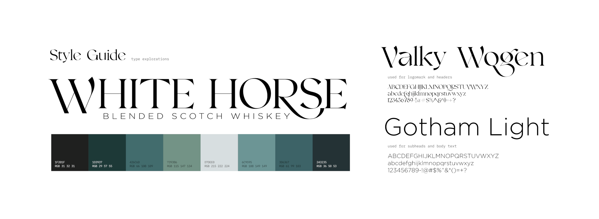
Label Design
I decided to pursue a direction with an illustrative label showcasing the White Horse, the Scottish Highlands, and some Scottish mythology. The illustration was created in Procreate, and final label was developed in Adobe Illustrator
Digital Brand Application
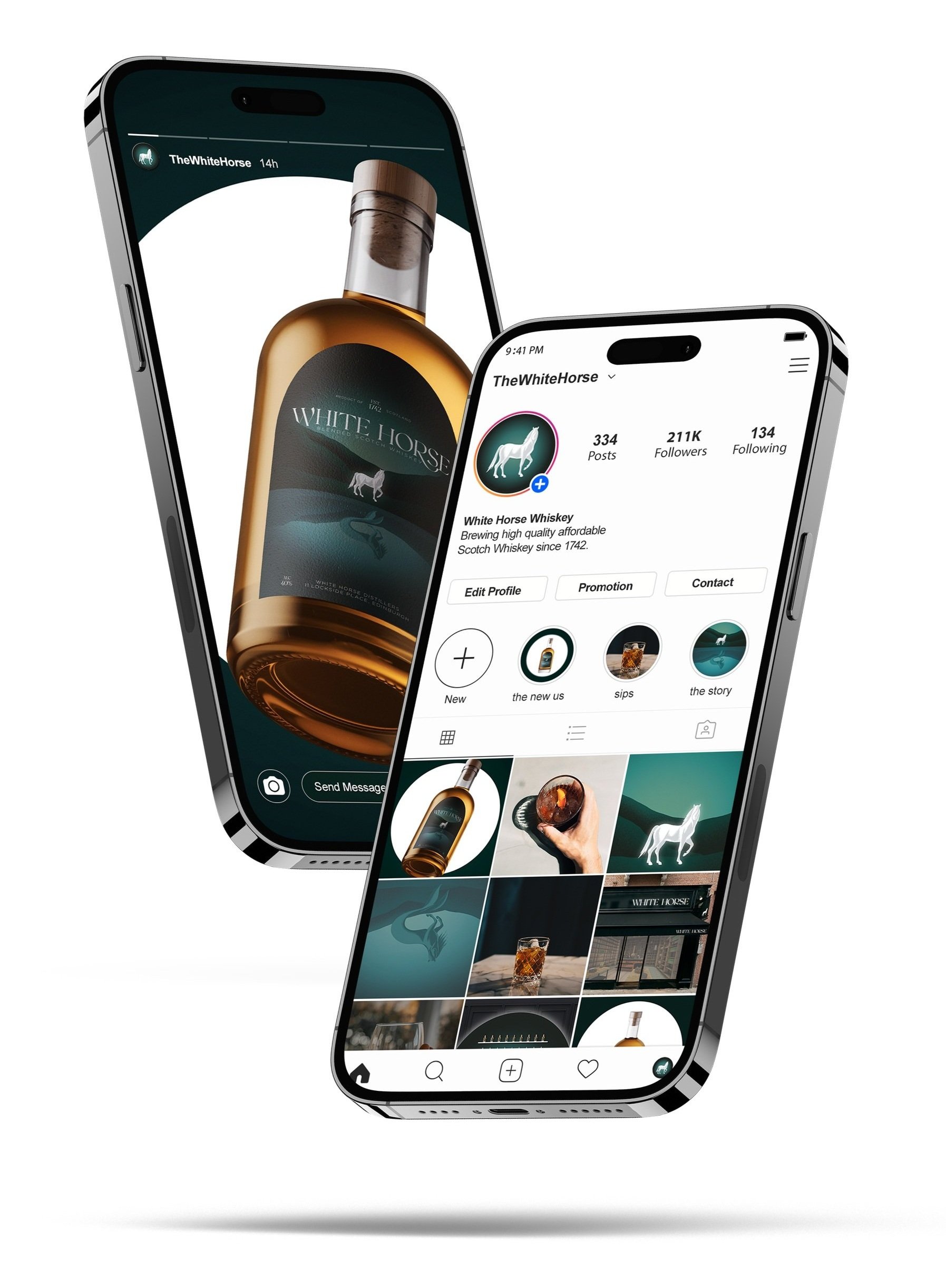
The current White Horse Whiskey has very little presence and no social media presence. The new White Horse is aiming to appeal to a younger more diverse audience, this audience is heavily involved in social media. To account for this, the new White Horse will have presence across various social media platforms. To the left is an example of how the new branding can translate over to an Instagram page.
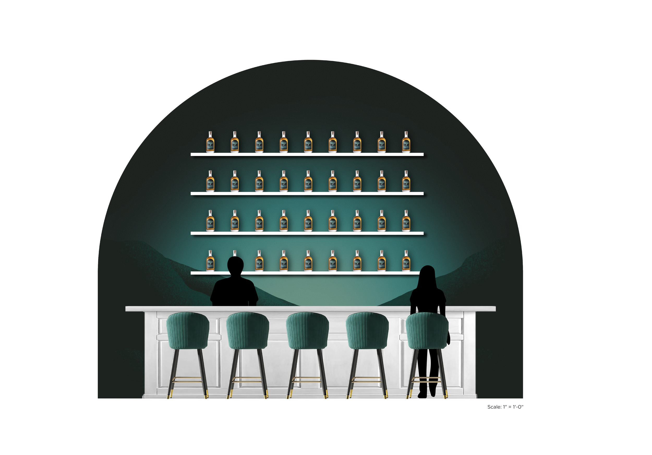
Environmental Brand Application
To the right are concept mockups for a pop-up experience to introduce the new White Horse Whiskey. The exterior is meant to emulate a traditional pub feel but with modern elements. The main features of the pub would be the bar, featuring drinks made with White Horse Blended Scotch Whiskey, and the “Instagram Wall.” The Instagram wall will feature the new label illustration and a life size horse sculpture, also from the label, with a neon/LED White Horse sign.


Brand History

Opportunity Assessment

Brand Positioning Matrix

SWOT Analysis

Audience
The majority of whiskey drinkers are still Caucasain men between the ages of 35-60. The current White Horse branding lends itself to the older audiences. Like stated previously, the rebranding of White Horse is centered around expanding the audience to include the younger demographics looking to start drinking whiskey.

Benchmarking/Inspiration
The overall purpose of the White Horse Whiskey rebrand is to expand the target market to include a younger more diverse demographic while honoring the White Horse’s rich Scottish history. In order to appeal to that younger demographic, I went with a graphic direction that would completely change the overall look and feel of White Horse.
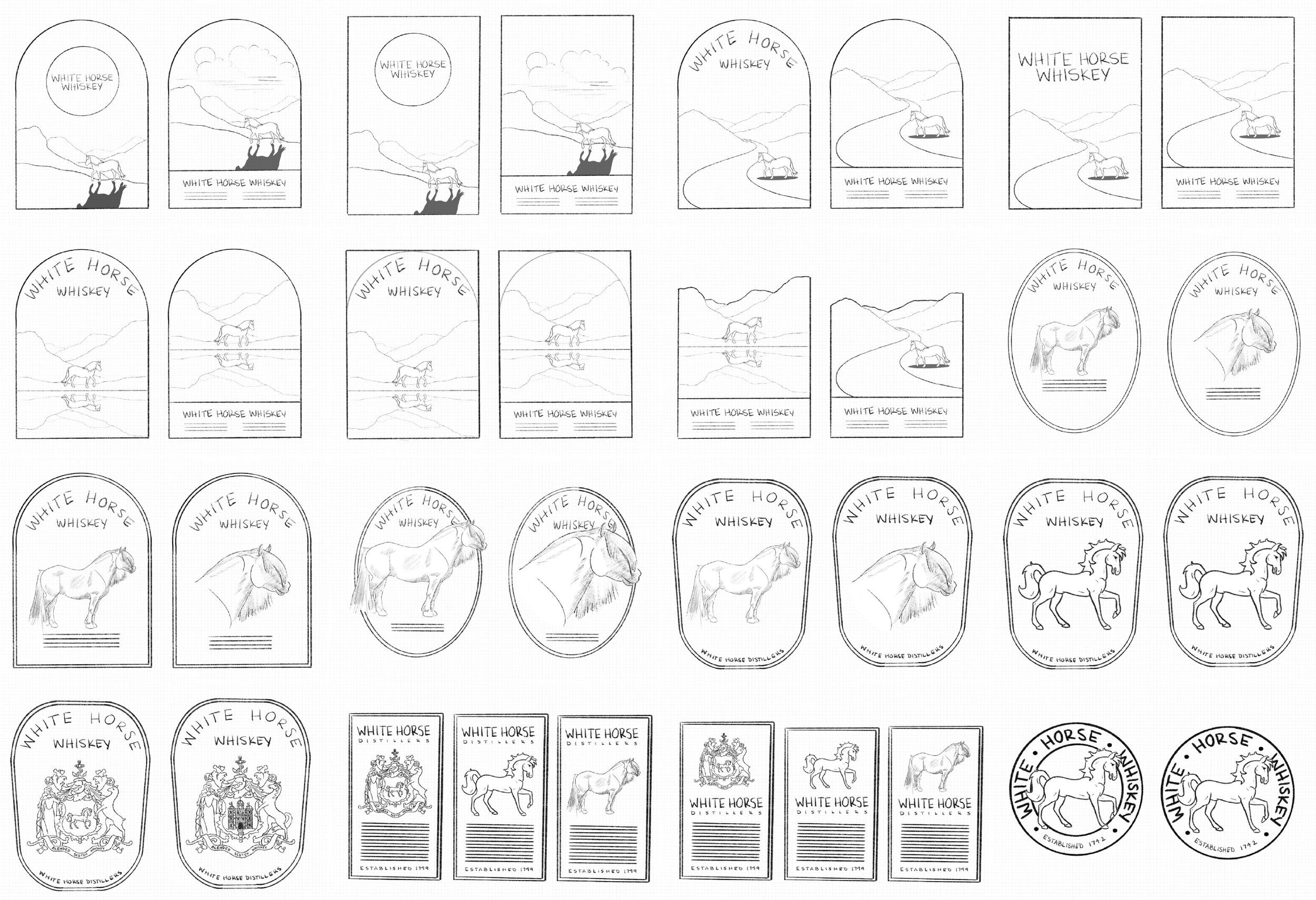
Preliminary Sketches

Digital Sketches

Final Label Options